Wednesday, 29 March 2017

editing front cover photo

i have edited this photo that i am using on my front cover by changing the brightness to -56 as this photo was originally very bright and didn't fit with the conventions of my magazine.
i have also changed the contrast to -2 which is a very minor adjustment as well as the hue and saturation to make the photo look as professional as possible so that it will have the greatest impact on my front cover.

Tuesday, 28 March 2017

half term plan

I am aiming to have magazine mainly completed before the half term and then when i come in at half term i will be able to make slight tweaks and adjustments so it will look as professional and conventional as possible.This will also give me enough time to fix anything if any mistakes are to happen so that i will still meet the deadline on the first Tuesday back.

Behind the scenes

here is a "behind the scenes" look at me and my model preparing for a photo session , here we are adjusting the lighting in order to get the desired effect which was one side of his face to be lighter and one to be slightly in the shadows

Monday, 27 March 2017

photo time line

i plan to have all my photos taken and edited by the end of this week. this means that i will have the final three weeks to change and edit layout , text etc to make sure that my magazine looks as professional as possible for the final draft.

photo for conetnts page

i will be using the schools photo studio again on Wednesday to take more photos but mainly full body or mid shots to go on the right side of my contents page.i will post a blog consisting of these photos

new fonts

In response to my last blog here is a list of my new fonts
CORE - Ascent 
GEOMETOS-Ascent 
LIBEL SUIT- Ascent 
URAE- Ascent
i will carry out market research and choose the font that wins. 

new fonts

i am planning on changing the font on my title. this means that instead of using the freshman font i will use another one as in my feedback from a teacher i got told that the most amateur looking part of my front cover was the text.
i will post a separate blog with the various potential fonts.

Wednesday, 22 March 2017

double page spread improvements and changes

this is my new double page spread that i have heavily based on the jay z double page that i earlier analysed. i still need to write the two columns on the right hand side as at the minute they are just filled with random text to show the effect. i have used a red and black gradient on the photo to give it a very similar effect to the jay z photographer using the red light on one side of his face. i have changed the whole layout of this page to make it look more conventional and professional which i believe i have achieved.

Tuesday, 21 March 2017

contents page photo - needs to be retaken

because of the white tee shirt that my model is wearing in this photo i am going to have to take the photos again because there is no definite lin between where his tee shirt ends and the white wall starts

Monday, 20 March 2017

photos taken in studio

This is an update on the photos that i said i was taking: it think they turned out very well and i will do a second post on deiding which photo i should use


Thursday, 16 March 2017

Asap rocky double page analysis 3

Picture
This double page spread features a wide shot of asap rocky standing against a cracked wall.unlike a lot of the other magazines I have looked at it has not cut the face and body out from the rest of the photo.he is wearing sunglasses a cap and chains around his neck
I will not be using jewlery in my shoot as the photos that I have took with it look abit put on and fake. So without the chain in my opinion looks more professional overall
Layout
Most of this double page spread is taken up by a large photo of asap rocky on the right hand side of the article. Then on the left is a big q magazine banner then a white box towards the bottom of the page where 3 columns of text are located. The white on black is a good contrast and makes the text pop out a lot from the otherwise really dark background.
I will also use 3 collums of text. Which seems to be a very clear convention. I will also include a clear branding of the magazine however I may not have it centred near the middle of the page instead I may choose to put it in a bottom corner.
Colour
This double page spread features very little colours other than black and white however this has a clear positive effect as it makes the white text box really stand out from the black/grey back ground. It also features the Q magazine in red which makes it stand out and is a constant reminder of which magazine ou are reading.
I will also incorporate the partly red logo into design so that the reader knows which magazine they are reading this will also make it clear to the reader that. They are reading my magazine.

Double page spread change in ideas

After looking at one of my favourite double page spread designs which feature jay z I have decided to base my double page spread around it , to do this I will use a close up shot and edit it so that half the photo is filtered in a sort of red colour. Overall this will make my magazine look very proffessional and therefore meeting our criteria which is to make a conventional music magazine.

Wednesday, 15 March 2017

double page analysis 1

this double page spread features jay z
layout
this double page spread features a clear split with a close up shot of jay z features half of the page whilst the other page is mostly writing in two large thick columns. with a big red J in the back ground which I'm presuming is for jay z it  also features a quote on top of the picture as well as a logo
I am thinking of heavily basing my double page on this one. I will divide my photo very like this one. however for mine I will use a definite split of half  being red and half being black and white which I think will give my double page a very similar feel to this one but with my own twist. I will also incorporate the big letter in the back ground as I feel it is a good way to bring colour to an otherwise bland slab of text.
picture
the picture in this double page spread features jay z as a close up wearing a chain and sunglasses. with a gradient red filter or red lighting. he has a very serious facial expression. with a very slight low angle.
for my photo I too will use a slight low angle with a very serious facial expression featuring on my models face. I will also use red filters to create a similar effect to this one.
text
The title to this article is quite small and features at the right side of the article at the very top.. it features a mix of two texts and black and red fonts. this creates an overall theme for the double page. it has also used drop capitals in the article which draws the readers attention in to the article. This article has also used good use of a huge j in the background which has been coloured a bright vibrant red which adds colour to the solid two columns of text.
for my magazine I am also going to stick to two font bebas neue and freshman. I will also use a main colour theme of black and red as I think this has the best effect and really makes the double page stand out. this will also fit in with the overall theme for my magazine and with the title which is also black and red.


Double page spread feedback

This is the feedback I received from my double page spread-

Make it carry over two pages so it looks more like a double page spread instead of two separate pages
Change layout and feature it on a previous double page
Have 3 columns of text
Include a caption for my photo
Make sure it flows and looks like the contents page and front cover so that it is clear they are part of the magazine.

I will post the final copy and improvements at a later date.

the good things that I can take from my rough cut are-
they liked the branding of ascent in the bottom left corner
they liked the styles of font
they liked the outline on the picture which made it stand out

Contents page feedback

for my rough cut I got the following advice and changes to make -

I need to include small descriptions under each story
I should in corporate the gold more into the contents page
Include a smaller photo at the bottom to fill some space
Make it fit in exactly with the front cover
Replace photo with a new one (photos have been taken)

I will post my improvements once I have completed my final copy

the good things that I took away from my rough cut were the following-
they liked the range of texts I had used
they liked the similarity between the front cover and the contents page .which meant it was clear that they were part of the same magazine.

Tuesday, 14 March 2017

front cover feedback

from my feedback I am going to improve and add the following things-

change the photo however keep it as a mid shot
more stories on the front
barcode
issue number
date
little copyright logo under title
overall more professional

will post again after final copy to say how I did each of these.

The positive things that I took away from my rough cut are as follows-

the title of my magazine looked professional and genuine
they liked the use of red gold and black throughout
liked the overall layout apart from the amount of titles.

new photos

tomorrow I am taking new photos for my front cover and contents page in the studio so that I get a clearer sharper picture that will look more professional will share the results in a later post

contents page analysis 4

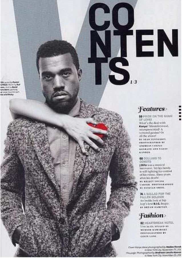
Kanye west contents page
layout
this contents page is image dominated with a large black and white photo of Kanye filling up the majority of the page. This gives the impression that Kanye will feature massively in this magazine and is a very important figure.
I will also make my contents page image dominated like this one. also I will include a brief description under each one of my featured stories to give the reader a brief description of the story to see if it something they would be interested in reading.
picture
the picture on this contents page features Kanye dressed in a smart outfit consisting of a shirt and jacket. while he almost stares into the camera. this gives the photo a sinister feel to it and makes Kanye seem almost better than the reader.
I will use more casual clothes than this however as this fits better with the general theme of outfits I have seen. However I will go for the same serious look.
text
the text on this contents page is in the bottom right of the contents page. with contents displayed in big black bold text at the top of the page. also behind Kanye they have placed a large v which is standing for vibe the name of the magazine which is a subtle reminder to the reader what magazine they are reading.
for my contents page I am going to place the picture on one side with the title slightly overlapping the top of the picture. I will also include the logo of my magazine somewhere on my magazine as this is one of the most reoccurring features of a contents page.
L

Friday, 3 March 2017

target audience specification

my target audience is 16-24 year old males I have identified this from previous rap magazines and forums as well as audience research.

Wednesday, 1 March 2017

Contents page analysis 3

This contnets page features former N.W.A rapper ice cube
Colour
The colours on this contents page has 3 'aim colours black white and red. This gives it a very clear and distinctive look. With half of the page featuring a translucent red column which means that you can still see half of ice cubes face behind it. Also having the large white text in the bottom corner makes it very clear and stand out from the rest of the page.
For my magazine I will use a 3 or 4 colour scheme similar to this one thing will feature the colours black white and red. With a further possibility of a colour such as gold.
Layout
This contents page is image dominated with a large close up of ice cubes face this covers nearly all of the page. Most of the right side of the page is covered by a red translucent Collum with features two different fonts in white. This gives the contents page a distinctive and unique looks to the rest that I have looked at.
I will lay my collums out very similar to this magazine as I will feature the page numbers down one side of the magazine .
Font
This magazine has used a fancy italic font for the page numbers and a thicker non-serriff font that makes all of the sub titles stand out the white text on the red background makes it easy to read and makes it stand out against the background. There is also a larger bold font in the bottom left of the photo in a bold white text which makes the story stand out from the picture and other text on the page.
I will use contrasting coloured font on my contents page just like in this one such as the black on white and the red on white. This will make my text stand out against the background. I will also use a mixture of seriff and san-seriff fonts.
Picture
The picture on this magazine is a close up of only ice cubes face showing him with a very serious almost angry facial expression whilst staring into the camera. This makes him look important and better than the reader who he is almost looking down upon the reader. The image has also had a black and white filter put on it , the overall effect of this is that the other text and the red collum stand out a lot more.
I will not use a close up on my contents page like this because the image has to be crystal clear in order to get the sort of effect that this contents page had achieved. Instead I will use a mid shot and position it at one side of my page.
Image result for ice cube contents