Monday, 1 May 2017

Copyright blocked my evaluation
I had included music in my evaluation as I didn't realise it had to be put on YouTube , I thought it was only going into a hand in folder so for this reason when I put I on you tube it was immediately blocked by universal music so I have had to replace this music with loyalty free beats to make it YouTube accessible .


filming of the evaluation

Wednesday, 26 April 2017
Evaluation time scale
I have planned to start recording my evaluation with the help of class mates and fellow rap music fans Dom and luke this will enable me to record my target audience feedback at the same time I will record it in the media studio in our school.this allows me to use a tripod and lighting.
Wednesday, 19 April 2017
ascent branding
on all three of my final pieces I have made sure that the ascent logo is present and clear.This means that the reader will have a constant reminder of the magazine that they are reading and makes the three pieces link together very well and so that you can tell that all three pieces are from ascent and from the same issue along with the colour scheme that furthers this point.
Tuesday, 18 April 2017
Evaluation info
For my evaluation I will use my iPhone to record the video and imovie to edit and arrange the clips this is simplistic and a software that I have used before so it shouldn't present too many problems , recording on my iPhone will still give good quality but ag the same time is portable and can be used at any time.
How I got my gold colour for my magazine
to get my gold colour for my magazine I took a photo of a gold chain and then used the colour dropper in order to replicate this gold colour then every time I wanted to use this colour I would simply get it from the colour palet where I had it saved his made sure that the colour was the same throughtout and didn't fluctuate from page to page
Start of evaluation
today I have started my evaluation I am choosing to do it in a video format as I feel it will be easier and more representative.This will make it easier to show the magazine whilst I am talking about it and my target audience is talking about it.
Choice of fonts
I have used san-seriff fonts throughout my magazine as I think it has a better effect as it looks less fancy and almost like handwriting. So to find my fonts I used dafont.com and went under the san-seriff to find bebaus neue and freshman. I experimented with other popular fonts from the website however I found that these two fonts had the best overall effect and made my magazine look as conventional and professional as possible
where did i take my photos
I took all my photos in the schools photography studio. the reason for doing this is as follows.
-I can get the correct lighting that I require for my photos
-it makes them easier to cut out on photoshop as I use a white background.
-I can take multiple photos leaving the camera on the tripod, so that later I can select the best photo.
-can positon the model in different ways all in the same location
-no worries about weather,wind or sun
-I can get the correct lighting that I require for my photos
-it makes them easier to cut out on photoshop as I use a white background.
-I can take multiple photos leaving the camera on the tripod, so that later I can select the best photo.
-can positon the model in different ways all in the same location
-no worries about weather,wind or sun
double page spread analysis 4

This double page spread features jay z
picture-
this double page spread uses a close up of jay z's face turned to the side and looking back at the camera.The photographer has also positioned a light on the side of his face so his face is very bright and clear as it is the main part of the image and the back of his head which is less significant is left in the dark.
For my image on my double page spread I am considering using a lighting effect just like on this photo to make the image really stand out and show off my photography knowledge and skills.
layout-
the picture of jay z on this page is very central with his head transitioning over the two pages with the 'j' from jay z being stretched vertically up his face whilst the other letters of his name are quite uniform.There is a quote at the top right of the double page set in a black box with a quote from the artist in it. the black background to this box makes it stand out on the page.
The planned layout from my magazine is very different from this one so there is not much that I can take from this even though it is a really good example of a double page spread.
text-There is two columns of text on this page one shorter in length than the other. underneath the white on black quote. at the bottom middle of the page there is the name of the artist on top of his picture with the j extended so it goes all the way up the image almost splitting the image in half. this makes it very clear as soon as you see the page who this story is about.
I am also looking for it to be very clear who my double spread is about so I will also include the artists name large on my double page and spread it across the two pages. However unlike this magazine I will have 3 columns of text as this is more conventional and that is what I am aiming for
Monday, 17 April 2017
progress with my magazine
over these Easter holidays I have added lots of slight tweaks and adjustments to my magazine. now I only have to write one more column of text on my double page spread then my magazine will be completed. This means I am on track to complete the task for my deadline which is the first Tuesday back after half term.
colour scheme
Throughout my magazine I have used black red and gold as the main colour schemes. These were regular colours that I have seen featured on other rap magazines so I have in corporated this into my magazine. The impact this has on my magazine as a result it looks more conventional and professional.
why i chose to do a rap magazine
I originally chose to do a rap magazine as I have only ever partly read one music magazine and it was a vibe magazine with Eminem on the cover. so this is the only prior knowledge that I had regarding music magazines.Another reason for this choice is that rap music is the main type of music I listen too and therefore is the genre that I have the most knowledge about
Wednesday, 12 April 2017
columns of text
for my columns of text I have chosen to use a 'qandA' layout as I have seen this feature in a number of the magazines I have looked at and it will be a lot easier to set out . I am also aware that I will have to use a very different dialect in the article as I talk very differently to a big time rapper. I will make a separate blog post on this topic.
evaluation decison
I am going to do a video for my evaluation as I believe it will be a better representation especially when talking about my target audience I can just simply interview people from my target audience
evaluation ideas
for my evaluation i am yet to decide which way I will do it.
the two options I have is as follows:
a video
a presentation that will then be presented back to my teacher
the two options I have is as follows:
a video
a presentation that will then be presented back to my teacher
Friday, 7 April 2017


Wednesday, 5 April 2017
my double page vs jay z double page
here you can see the clear similarities between my contents age and the jay z double page spread even thought i have just filled my columns by entering random text to show the final effect


Tuesday, 4 April 2017
the justifictation of why i have not used jewlery
even though I have identified jewellery as a typical convention of a rap magazine I have not included it in magazine for the following reason. When I was in the studio experimenting with both the schools gold chains as well as a thick gold chain that I purchased from top man. realised that it looked very tacky compared to something that a rapper such a lil Wayne or dr dre would wear which will be worth thousands of dollars and be covered in diamonds and other exquisite jewels.so the type of jewellery that I have available to me just didn't give off the same impression and instead made the impression of a sort of spin off of a rap magazine. so overall it made the magazine look very amateur and made my main cover star flava playa look completely fake as I do have some rapper brands available to me such as supreme like I have explained in an earlier post but I just don't have the type of chains or watches that would make a positive impact on my magazine. so I am writing this blog to explain a pretty crucial point in my project.
in summary these are the basic reasons for me not including the jewellery aspect in my magazine
-I do not have the right sort of jewellery available to me
-the jewellery that I can get makes the photos look amateur and my rappers fake
-The effect of fake gold and fake diamonds just gives off the wrong look compared to the real thing.
-It looked tacky and was obviously fake which took away from all the work I had done making the artists look as genuine as possible.
-overall it made a negative effect on my magazine and had the complete opposite effect I was looking for.
so because of all this I have made the justified decision to not use the chains etc that feature in many rap magazines even though I would of loved to include a realistic looking chain that gave off the correct impression.
I will post an example of the chain I tried in a future blog post
in summary these are the basic reasons for me not including the jewellery aspect in my magazine
-I do not have the right sort of jewellery available to me
-the jewellery that I can get makes the photos look amateur and my rappers fake
-The effect of fake gold and fake diamonds just gives off the wrong look compared to the real thing.
-It looked tacky and was obviously fake which took away from all the work I had done making the artists look as genuine as possible.
-overall it made a negative effect on my magazine and had the complete opposite effect I was looking for.
so because of all this I have made the justified decision to not use the chains etc that feature in many rap magazines even though I would of loved to include a realistic looking chain that gave off the correct impression.
I will post an example of the chain I tried in a future blog post
market research - name part 2
here is the results of my second twitter pole represented in a pie chart that show my current name ascent won with a majority of 42 percent meaning that I am going to keep it however I am going to adjust the character characteristics of the word to make it fill the top of my front cover and look overall more professional and conventional.


CHANGE OF NAME ?
these are the results of my survey that I conducted over twitter I had a total of 52 answers.Because it was a 50/50 split this means I will conduct another survey but include 4 names including my current name ascent and the winner of this will decide my final name choice.


Wednesday, 29 March 2017
editing front cover photo

i have also changed the contrast to -2 which is a very minor adjustment as well as the hue and saturation to make the photo look as professional as possible so that it will have the greatest impact on my front cover.
Tuesday, 28 March 2017
half term plan
I am aiming to have magazine mainly completed before the half term and then when i come in at half term i will be able to make slight tweaks and adjustments so it will look as professional and conventional as possible.This will also give me enough time to fix anything if any mistakes are to happen so that i will still meet the deadline on the first Tuesday back.
Behind the scenes

Monday, 27 March 2017
photo time line
i plan to have all my photos taken and edited by the end of this week. this means that i will have the final three weeks to change and edit layout , text etc to make sure that my magazine looks as professional as possible for the final draft.
photo for conetnts page
i will be using the schools photo studio again on Wednesday to take more photos but mainly full body or mid shots to go on the right side of my contents page.i will post a blog consisting of these photos
new fonts
In response to my last blog here is a list of my new fonts
CORE - Ascent
URAE- Ascent
i will carry out market research and choose the font that wins.
CORE - Ascent
URAE- Ascent
i will carry out market research and choose the font that wins.
new fonts
i am planning on changing the font on my title. this means that instead of using the freshman font i will use another one as in my feedback from a teacher i got told that the most amateur looking part of my front cover was the text.
i will post a separate blog with the various potential fonts.
i will post a separate blog with the various potential fonts.
Wednesday, 22 March 2017
double page spread improvements and changes

Tuesday, 21 March 2017
contents page photo - needs to be retaken

Monday, 20 March 2017
photos taken in studio
This is an update on the photos that i said i was taking: it think they turned out very well and i will do a second post on deiding which photo i should use


Thursday, 16 March 2017
Asap rocky double page analysis 3
Picture
This double page spread features a wide shot of asap rocky standing against a cracked wall.unlike a lot of the other magazines I have looked at it has not cut the face and body out from the rest of the photo.he is wearing sunglasses a cap and chains around his neck
I will not be using jewlery in my shoot as the photos that I have took with it look abit put on and fake. So without the chain in my opinion looks more professional overall
Layout
Most of this double page spread is taken up by a large photo of asap rocky on the right hand side of the article. Then on the left is a big q magazine banner then a white box towards the bottom of the page where 3 columns of text are located. The white on black is a good contrast and makes the text pop out a lot from the otherwise really dark background.
I will also use 3 collums of text. Which seems to be a very clear convention. I will also include a clear branding of the magazine however I may not have it centred near the middle of the page instead I may choose to put it in a bottom corner.
Colour
This double page spread features very little colours other than black and white however this has a clear positive effect as it makes the white text box really stand out from the black/grey back ground. It also features the Q magazine in red which makes it stand out and is a constant reminder of which magazine ou are reading.
I will also incorporate the partly red logo into design so that the reader knows which magazine they are reading this will also make it clear to the reader that. They are reading my magazine.
This double page spread features a wide shot of asap rocky standing against a cracked wall.unlike a lot of the other magazines I have looked at it has not cut the face and body out from the rest of the photo.he is wearing sunglasses a cap and chains around his neck
I will not be using jewlery in my shoot as the photos that I have took with it look abit put on and fake. So without the chain in my opinion looks more professional overall
Layout
Most of this double page spread is taken up by a large photo of asap rocky on the right hand side of the article. Then on the left is a big q magazine banner then a white box towards the bottom of the page where 3 columns of text are located. The white on black is a good contrast and makes the text pop out a lot from the otherwise really dark background.
I will also use 3 collums of text. Which seems to be a very clear convention. I will also include a clear branding of the magazine however I may not have it centred near the middle of the page instead I may choose to put it in a bottom corner.
Colour
This double page spread features very little colours other than black and white however this has a clear positive effect as it makes the white text box really stand out from the black/grey back ground. It also features the Q magazine in red which makes it stand out and is a constant reminder of which magazine ou are reading.
I will also incorporate the partly red logo into design so that the reader knows which magazine they are reading this will also make it clear to the reader that. They are reading my magazine.
Double page spread change in ideas
After looking at one of my favourite double page spread designs which feature jay z I have decided to base my double page spread around it , to do this I will use a close up shot and edit it so that half the photo is filtered in a sort of red colour. Overall this will make my magazine look very proffessional and therefore meeting our criteria which is to make a conventional music magazine.
Wednesday, 15 March 2017
double page analysis 1

this double page spread features jay z
layout
this double page spread features a clear split with a close up shot of jay z features half of the page whilst the other page is mostly writing in two large thick columns. with a big red J in the back ground which I'm presuming is for jay z it also features a quote on top of the picture as well as a logo
I am thinking of heavily basing my double page on this one. I will divide my photo very like this one. however for mine I will use a definite split of half being red and half being black and white which I think will give my double page a very similar feel to this one but with my own twist. I will also incorporate the big letter in the back ground as I feel it is a good way to bring colour to an otherwise bland slab of text.
picture
the picture in this double page spread features jay z as a close up wearing a chain and sunglasses. with a gradient red filter or red lighting. he has a very serious facial expression. with a very slight low angle.
for my photo I too will use a slight low angle with a very serious facial expression featuring on my models face. I will also use red filters to create a similar effect to this one.
text
The title to this article is quite small and features at the right side of the article at the very top.. it features a mix of two texts and black and red fonts. this creates an overall theme for the double page. it has also used drop capitals in the article which draws the readers attention in to the article. This article has also used good use of a huge j in the background which has been coloured a bright vibrant red which adds colour to the solid two columns of text.
for my magazine I am also going to stick to two font bebas neue and freshman. I will also use a main colour theme of black and red as I think this has the best effect and really makes the double page stand out. this will also fit in with the overall theme for my magazine and with the title which is also black and red.
Double page spread feedback
This is the feedback I received from my double page spread-
Make it carry over two pages so it looks more like a double page spread instead of two separate pages
Change layout and feature it on a previous double page
Have 3 columns of text
Include a caption for my photo
Make sure it flows and looks like the contents page and front cover so that it is clear they are part of the magazine.
I will post the final copy and improvements at a later date.
the good things that I can take from my rough cut are-
they liked the branding of ascent in the bottom left corner
they liked the styles of font
they liked the outline on the picture which made it stand out

Make it carry over two pages so it looks more like a double page spread instead of two separate pages
Change layout and feature it on a previous double page
Have 3 columns of text
Include a caption for my photo
Make sure it flows and looks like the contents page and front cover so that it is clear they are part of the magazine.
I will post the final copy and improvements at a later date.
the good things that I can take from my rough cut are-
they liked the branding of ascent in the bottom left corner
they liked the styles of font
they liked the outline on the picture which made it stand out

Contents page feedback
for my rough cut I got the following advice and changes to make -
I need to include small descriptions under each story
I should in corporate the gold more into the contents page
Include a smaller photo at the bottom to fill some space
Make it fit in exactly with the front cover
Replace photo with a new one (photos have been taken)
I will post my improvements once I have completed my final copy
the good things that I took away from my rough cut were the following-
they liked the range of texts I had used
they liked the similarity between the front cover and the contents page .which meant it was clear that they were part of the same magazine.

I need to include small descriptions under each story
I should in corporate the gold more into the contents page
Include a smaller photo at the bottom to fill some space
Make it fit in exactly with the front cover
Replace photo with a new one (photos have been taken)
I will post my improvements once I have completed my final copy
the good things that I took away from my rough cut were the following-
they liked the range of texts I had used
they liked the similarity between the front cover and the contents page .which meant it was clear that they were part of the same magazine.

Tuesday, 14 March 2017
front cover feedback
from my feedback I am going to improve and add the following things-
change the photo however keep it as a mid shot
more stories on the front
barcode
issue number
date
little copyright logo under title
overall more professional
will post again after final copy to say how I did each of these.
The positive things that I took away from my rough cut are as follows-
the title of my magazine looked professional and genuine
they liked the use of red gold and black throughout
liked the overall layout apart from the amount of titles.

change the photo however keep it as a mid shot
more stories on the front
barcode
issue number
date
little copyright logo under title
overall more professional
will post again after final copy to say how I did each of these.
The positive things that I took away from my rough cut are as follows-
the title of my magazine looked professional and genuine
they liked the use of red gold and black throughout
liked the overall layout apart from the amount of titles.

new photos
tomorrow I am taking new photos for my front cover and contents page in the studio so that I get a clearer sharper picture that will look more professional will share the results in a later post
contents page analysis 4
Kanye west contents page
layout
this contents page is image dominated with a large black and white photo of Kanye filling up the majority of the page. This gives the impression that Kanye will feature massively in this magazine and is a very important figure.
I will also make my contents page image dominated like this one. also I will include a brief description under each one of my featured stories to give the reader a brief description of the story to see if it something they would be interested in reading.
picture
the picture on this contents page features Kanye dressed in a smart outfit consisting of a shirt and jacket. while he almost stares into the camera. this gives the photo a sinister feel to it and makes Kanye seem almost better than the reader.
I will use more casual clothes than this however as this fits better with the general theme of outfits I have seen. However I will go for the same serious look.
text
the text on this contents page is in the bottom right of the contents page. with contents displayed in big black bold text at the top of the page. also behind Kanye they have placed a large v which is standing for vibe the name of the magazine which is a subtle reminder to the reader what magazine they are reading.
for my contents page I am going to place the picture on one side with the title slightly overlapping the top of the picture. I will also include the logo of my magazine somewhere on my magazine as this is one of the most reoccurring features of a contents page.
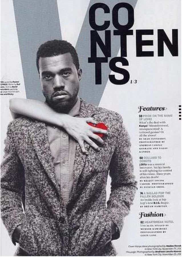
layout
this contents page is image dominated with a large black and white photo of Kanye filling up the majority of the page. This gives the impression that Kanye will feature massively in this magazine and is a very important figure.
I will also make my contents page image dominated like this one. also I will include a brief description under each one of my featured stories to give the reader a brief description of the story to see if it something they would be interested in reading.
picture
the picture on this contents page features Kanye dressed in a smart outfit consisting of a shirt and jacket. while he almost stares into the camera. this gives the photo a sinister feel to it and makes Kanye seem almost better than the reader.
I will use more casual clothes than this however as this fits better with the general theme of outfits I have seen. However I will go for the same serious look.
text
the text on this contents page is in the bottom right of the contents page. with contents displayed in big black bold text at the top of the page. also behind Kanye they have placed a large v which is standing for vibe the name of the magazine which is a subtle reminder to the reader what magazine they are reading.
for my contents page I am going to place the picture on one side with the title slightly overlapping the top of the picture. I will also include the logo of my magazine somewhere on my magazine as this is one of the most reoccurring features of a contents page.
Friday, 3 March 2017
target audience specification
my target audience is 16-24 year old males I have identified this from previous rap magazines and forums as well as audience research.
Wednesday, 1 March 2017
Contents page analysis 3
This contnets page features former N.W.A rapper ice cube
Colour
The colours on this contents page has 3 'aim colours black white and red. This gives it a very clear and distinctive look. With half of the page featuring a translucent red column which means that you can still see half of ice cubes face behind it. Also having the large white text in the bottom corner makes it very clear and stand out from the rest of the page.
For my magazine I will use a 3 or 4 colour scheme similar to this one thing will feature the colours black white and red. With a further possibility of a colour such as gold.
Layout
This contents page is image dominated with a large close up of ice cubes face this covers nearly all of the page. Most of the right side of the page is covered by a red translucent Collum with features two different fonts in white. This gives the contents page a distinctive and unique looks to the rest that I have looked at.
I will lay my collums out very similar to this magazine as I will feature the page numbers down one side of the magazine .
Font
This magazine has used a fancy italic font for the page numbers and a thicker non-serriff font that makes all of the sub titles stand out the white text on the red background makes it easy to read and makes it stand out against the background. There is also a larger bold font in the bottom left of the photo in a bold white text which makes the story stand out from the picture and other text on the page.
I will use contrasting coloured font on my contents page just like in this one such as the black on white and the red on white. This will make my text stand out against the background. I will also use a mixture of seriff and san-seriff fonts.
Picture
The picture on this magazine is a close up of only ice cubes face showing him with a very serious almost angry facial expression whilst staring into the camera. This makes him look important and better than the reader who he is almost looking down upon the reader. The image has also had a black and white filter put on it , the overall effect of this is that the other text and the red collum stand out a lot more.
I will not use a close up on my contents page like this because the image has to be crystal clear in order to get the sort of effect that this contents page had achieved. Instead I will use a mid shot and position it at one side of my page.

Colour
The colours on this contents page has 3 'aim colours black white and red. This gives it a very clear and distinctive look. With half of the page featuring a translucent red column which means that you can still see half of ice cubes face behind it. Also having the large white text in the bottom corner makes it very clear and stand out from the rest of the page.
For my magazine I will use a 3 or 4 colour scheme similar to this one thing will feature the colours black white and red. With a further possibility of a colour such as gold.
Layout
This contents page is image dominated with a large close up of ice cubes face this covers nearly all of the page. Most of the right side of the page is covered by a red translucent Collum with features two different fonts in white. This gives the contents page a distinctive and unique looks to the rest that I have looked at.
I will lay my collums out very similar to this magazine as I will feature the page numbers down one side of the magazine .
Font
This magazine has used a fancy italic font for the page numbers and a thicker non-serriff font that makes all of the sub titles stand out the white text on the red background makes it easy to read and makes it stand out against the background. There is also a larger bold font in the bottom left of the photo in a bold white text which makes the story stand out from the picture and other text on the page.
I will use contrasting coloured font on my contents page just like in this one such as the black on white and the red on white. This will make my text stand out against the background. I will also use a mixture of seriff and san-seriff fonts.
Picture
The picture on this magazine is a close up of only ice cubes face showing him with a very serious almost angry facial expression whilst staring into the camera. This makes him look important and better than the reader who he is almost looking down upon the reader. The image has also had a black and white filter put on it , the overall effect of this is that the other text and the red collum stand out a lot more.
I will not use a close up on my contents page like this because the image has to be crystal clear in order to get the sort of effect that this contents page had achieved. Instead I will use a mid shot and position it at one side of my page.
Wednesday, 15 February 2017
Contents page analysis 2
This contents page features 50 cent -
Picture
On this contents page it features a mid shot of 50 cent turned to his side looking back at the camera.he is dressed in mainly black clothing featuring a black bandana.you can also see a chain around his neck as well as tattoos on his arm. This gives him a threatening look.as for his facial expression it is very serious
From this I will make sure that my model is dressed in black colours.also I will have him with a very serious almost angry facial expression. This will give my magazine a realistic look and therefore meet the criteria for my magazine to look conventional.
Colour
This contents page sticks to a three colour scheme consisting of black,white and red.with the page numbers in the same bright red. This makes the column of text on the right stand out and it also makes it clear where the readers attention should be focused on. Also the colours of 50 cents clothing being black makes him stand out because the black of his top and bandana contrasts with the white background.
For my contents page I will use a 3 or 4 colour scheme and use the same colours from my front page so that it is very clear to the reader that they are part of the same magazine.
Layout
This is an example of a image dominated contents page. With 50 cent taking up most of the right side of the contents page.this gives the impression to the reader that 50 cent is the main focus of this magazine.
For my magazine I will also use a image on my contents page and make it the same person that features on my front cover.
Text
This contents page uses a bold font on the titles. Also the '48' which the 50 cent story is in a bigger text linking in with the photo above. Also there is a small font under each story briefly explaining the story.
I will use the larger font idea in my final piece to link the photo in with the text and double page spread I will include.

Front cover analysis 4
This I a example of a front cover from 'the source' it features big dean on the front cover showing off his variety of rings and gold watch.
Picture
The picture on the front of this magazine is a close up of rapper big Sean . The picture seems to have been cut out from its original background and placed instead upon a grey background.As in the other magazines the rapper featured on the cover is looking very serious and staring into the camera.
For my magazine I will have my model with a very serious facial expression and staring into the camera for my front cover picture.However I may use a mid shot instead of a close up as I think the covers that I have looked at with mid shots looks better than with a close up.
Colour
This magazine sticks to a 3 colour scheme very similar to the other magazines that I have looked at.it sticks to mainly grey,black and red with a few bits of white text. This makes this magazine look very similar to all of the others however the bright red writing still makes it stand out on the shelf next to any of its competitors.
For my magazine I am going to use a 3 colour scheme mainly with potentially one more colour which will only be slightly included. This will make my magazine look professional and conventional. Which is my aim in this task.
Layout
As in the rest of the magazines that I have looked at the article titles have been positioned small to one side of the magazine.Also the picture overlaps the text like the rest of the magazine so it is clear to me that I need to include this in my design. This front cover also has the artists name large on the front of the magazine.making it very clear what the main focus of this magazine is. It has also included 4 names of artists such as 'juicy j' for example. This is enticing to the reader as they know that these artists must be included in some way inside.it has also included a barcode , small logo and social media platforms.
I will include most of these features in my cover as it will make it look conventional. This means that it will meet my criteria for my magazine to look exactly the same as the rest of main stream rap music magazines.
Text
 The text in this magazine is San-serif meaning that there are no Flicky ends on the letters this gives the magazine a serious tone.This cover uses the same text all the way through and an italic version of the font for the initials 'mchg' Also the name of the magazine has a bit of a back shadow to it which makes the text look like it is slightly popping out from the magzine along with the red text gives it a very good impact and makes it stand out significantly compared to the other writing on the page.
I will use back shadowing on my magazines name so that it stands out from the rest of the page. This will give my magazine a distinctive look and make it stand out on the shelf next to its competitors

Picture
The picture on the front of this magazine is a close up of rapper big Sean . The picture seems to have been cut out from its original background and placed instead upon a grey background.As in the other magazines the rapper featured on the cover is looking very serious and staring into the camera.
For my magazine I will have my model with a very serious facial expression and staring into the camera for my front cover picture.However I may use a mid shot instead of a close up as I think the covers that I have looked at with mid shots looks better than with a close up.
Colour
This magazine sticks to a 3 colour scheme very similar to the other magazines that I have looked at.it sticks to mainly grey,black and red with a few bits of white text. This makes this magazine look very similar to all of the others however the bright red writing still makes it stand out on the shelf next to any of its competitors.
For my magazine I am going to use a 3 colour scheme mainly with potentially one more colour which will only be slightly included. This will make my magazine look professional and conventional. Which is my aim in this task.
Layout
As in the rest of the magazines that I have looked at the article titles have been positioned small to one side of the magazine.Also the picture overlaps the text like the rest of the magazine so it is clear to me that I need to include this in my design. This front cover also has the artists name large on the front of the magazine.making it very clear what the main focus of this magazine is. It has also included 4 names of artists such as 'juicy j' for example. This is enticing to the reader as they know that these artists must be included in some way inside.it has also included a barcode , small logo and social media platforms.
I will include most of these features in my cover as it will make it look conventional. This means that it will meet my criteria for my magazine to look exactly the same as the rest of main stream rap music magazines.
Text

I will use back shadowing on my magazines name so that it stands out from the rest of the page. This will give my magazine a distinctive look and make it stand out on the shelf next to its competitors
Monday, 13 February 2017
Start of in design
here is my start of my in design , so far i have only started thing about the layout and colour scheme of my front cover i have inserted the freshman font and positioned it in white at the top left of the page and made a solid black back layer.
Friday, 10 February 2017
front cover analysis 3
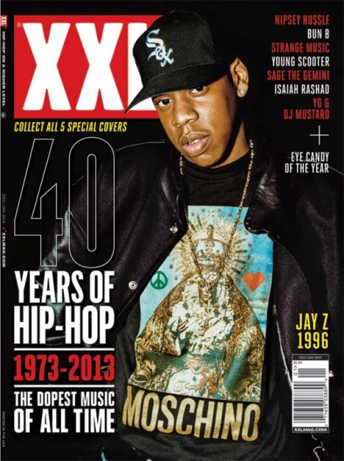
This is the XXX cover with jay z-
picture
The picture on this cover is a portrait photo of jay z wearing a "moschino" top which is a expensive high end brand, which have been purposefully shown off in this photo. As in the other front cover I have analysed there is only one person on the cover with a very plain background. Also on this front cover the rapper is pictured with a very serious facial expression.
Because of this I am going to have my model with a very serious facial expression and just like I this example having him almost staring down at the camera. It is also now very clear to me that nearly all rap magazines feature a male on the front due to this genre of music being very male dominated.
colour
This magazine cover is mainly made up of black, white and red with a slight selection of other colours on the designer t-shirt such as blue and gold.The background is mainly black meaning that the image and title really stand out as they are the most important factors of a front cover.
This confirms that i do need to stick to a 3 colour scheme such as black red and white.
Layout
As in previous front covers that i have analysed the photo is a mid shot clearly showing off the rappers wealth.This like all of the other magazines i have looked at have the image slightly overlapping the text but not too much that it is unreadable.
I will incorporate this into my magazine by overlapping my title 'ascent' with my portrait image. This will make it look professional and authentic
Thursday, 9 February 2017
possible fonts
For my rap/hip hop magazine i have acquired the following fonts from dafont.com
from the fonts i have gathered my current favourite is freshman as i think it looks most like a font that would be found on the front of a rap magazine. also a main convention of a rap magazine is that the picture needs to overlap the title and i believe this font will still be legible after i have positioned the picture in such a way
Bebas neue–
ascent
chosence
bold – ascent
code
bold – ascent
freshman-
ascent
mark fresh
bold – ascent
Names for magazine- market research
rap/hip hop magazine names
i asked 15 class mates that fit into my target demographic what name i should choose out of the following options:
focus
infinite
ascent
defused
From these results ascent was a clear winner
i asked 15 class mates that fit into my target demographic what name i should choose out of the following options:
focus
infinite
ascent
defused
|
Name of magazine
|
|
|
Focus
|
1 vote
|
|
Infinite
|
2 vote
|
|
Ascent
|
10 votes
|
|
Defused
|
2 votes
|
Wednesday, 8 February 2017
front cover analysis 2
This is a magazine featuring Eminem-
picture
In this magazine they have used Photoshop to cut just Eminem's body and face out from the background as some of the other magazines I have analysed have left the original background in.The image has also been turned black and white. The image is in the very centre of the page reaching almost from the bottom to the very top it fills up the middle three vertical columns in the rule of thirds.
From this i am going to have a portrait photo on the cover and have it contrasting with the colour of the background as this is a thing i am regularly.I am also considering having a black and white imgae like in this exmaple but i will not make my deciosn until the photos have been taken.
colour
The colour of the front cover is mainly composed of three colours red,black and white. this makes the black and white image really stand out on the bright red background. This also makes the magazine stand out on the shelf as it is bright and makes and you want to read it.
From this example i have decided that i will use a 3 colour scheme with black, white and red. This will make my magazine look contemporary and modern. This will give my magazine a look which looks professional.
layout
The photo is positioned in the very centre of The page filling the middle three vertical sectors , with the word Eminem in the very centre of the page in large white writing , the title of the magazine "billboard" has been positioned in the top left in smaller text than the other examples that i have looked it.there is also a paragraph in text to the right of the title which i cannot read on the computer as it is too small.
I am going to set my magazine out in a very similar way to this example with a portrait photo cut out from the background set against a contrasting background. My cover will also be very like this simple front cover and potentially include the artists name across the very centre of the page.

target audience lesson
we were introduced to target audiences and have been told to identify our target audience for our magazine.
i have identified my main target audience as male between the ages of 16-24
i will do extra research into this demographic and present my findigns at a later date in both tables and graphs
i have identified my main target audience as male between the ages of 16-24
i will do extra research into this demographic and present my findigns at a later date in both tables and graphs
model - outfit choices
From my research so far it is clear to me that fashion and brands are a key part of any good media magazine:
these are my initial idea regarding my models choice of clothing as it seems to be a huge factor. below there is 4 examples of clothing items that i will use for my photos this is because rappers such as drake Travis Scott asap rocky, Chris brown and kanye west all wear these brands regularly so it would make my magazine seem more legit.As you can see in my previous research and what i will publish in the coming days that brands and fashion statements feature regularly throughout the magazines.


here are examples of where rappers have worn these brands:


here are examples of Chris brown skepta drake and Travis Scott wearing the same brands as above
these are my initial idea regarding my models choice of clothing as it seems to be a huge factor. below there is 4 examples of clothing items that i will use for my photos this is because rappers such as drake Travis Scott asap rocky, Chris brown and kanye west all wear these brands regularly so it would make my magazine seem more legit.As you can see in my previous research and what i will publish in the coming days that brands and fashion statements feature regularly throughout the magazines.
here are examples of where rappers have worn these brands:


here are examples of Chris brown skepta drake and Travis Scott wearing the same brands as above
Subscribe to:
Posts (Atom)